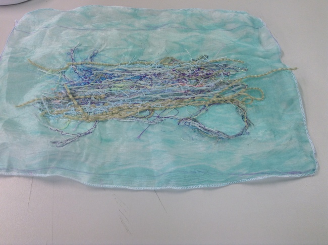
10.3.15 Studio design lectures and tutorials.
Posted: March 10, 2015 Filed under: ADZ5888, Subject, textiles | Tags: ADZ5777, print, subject, textiles Leave a commentToday we were briefed on how to create a accurate repeat pattern using grid paper and tracing paper. I found this a veryusuful lecture because I believe that by using more physical and traditional methods to create patterned repeats is a rare and valuable skill to have in a generation where technology is so heavily depended on, I also feel as though there is a greater sense of quality when you have a physical design in front of you. I find it a much more rewarding and satisfying process by creating repeats this was as it also helps me to work on my organisation, drawing skills, presentation and quality control so by using a more practical method I am refining skills I would otherwise not really use when using Photoshop or Illustrator.
Where I was very sloppy and careless with my work before part two I can now see how I am trying to be more professional and organised within my work, I am really pleased with this because it means the old bad habits are being replaced with good ones.
I feel as though my tutorial went really well, I did originally struggle to understand the brief by my tutor went through it step by step to ensure I understood what I had to by the end of the session. It is evident that I need far more imagery rather than just focussing on the one beetle, Helen suggested breaking my designs up into four “families” which means looking a four different ways I could experiment with the design for example family 1: experimenting with texture, family two experimenting with layout est. I believe by doing this it will make the work load seem a lot less daunting and more manageable.
I am really looking forward to creating my final twelve designs and I am also really pleased with what I have learnt today including the guidelines on copyright laws. I feel as thought today has been very successful and I look forward to continuing my experimentation tomorrow.

An examples of a free flowing design which is layered and uses interesting motifs through the use of mark making.
5.3.15 Workshop day.
Posted: March 5, 2015 Filed under: ADZ5777, print, Subject, textiles | Tags: ADZ5777, print, subject, textiles Leave a commentToday I was shown how to do repeat patterns on photoshop, I fund this a very helpful session because I am familiar with the controls and commands that help towards creating a repeat pattern but couldn’t remember the order they went in. I feel more confident now that by the end of the week these skills will aid my designs.
By the afternoon we were shown how to create a repeat pattern with accuracy when layering multiple screens. I had a lot of questions to ask with regards to techniques I had learnt from my placement and if I could apply the skills I learnt to my practice in university such as using a laser if I wanted very precise accuracy, for example trying to layer an outline over an image. Steve the print technical did advice I didn’t do that due to the complexity of it he suggested working with designs that sit next to each other not directly on top of one another because if one of the screens is slightly out it will show. I appreciate his advice and can see where he’s coming from, by doing this I would be making more work for myself and I would prefer to work quickly and effciently opposed to spending a lot more time on trying to get a perfect line up. The time spent doing that could be better spent experimenting and researching further. I was advised that if I did want a very detailed print then the digital print machines would be a more appropriate method.
This has made me reconsider the level of detail I want in my designs, as I would much prefer to be able to experiment with inks, pastes and materials I want to stick to screen printing opposed to working with digital stitch. All this means is that I will have to carefully think about how my mark marking on my design will translate into silk screen. I believe by making more bold likes and perhaps experimenting with half tone would be interesting.
Overall I have really enjoyed today and feel as though I have had a lot of questions answered and now feel more confident with photoshop and my planned designs.
13.02.15 Work Experience Visible ART final day.
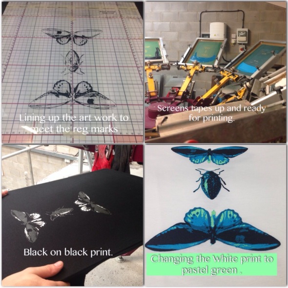
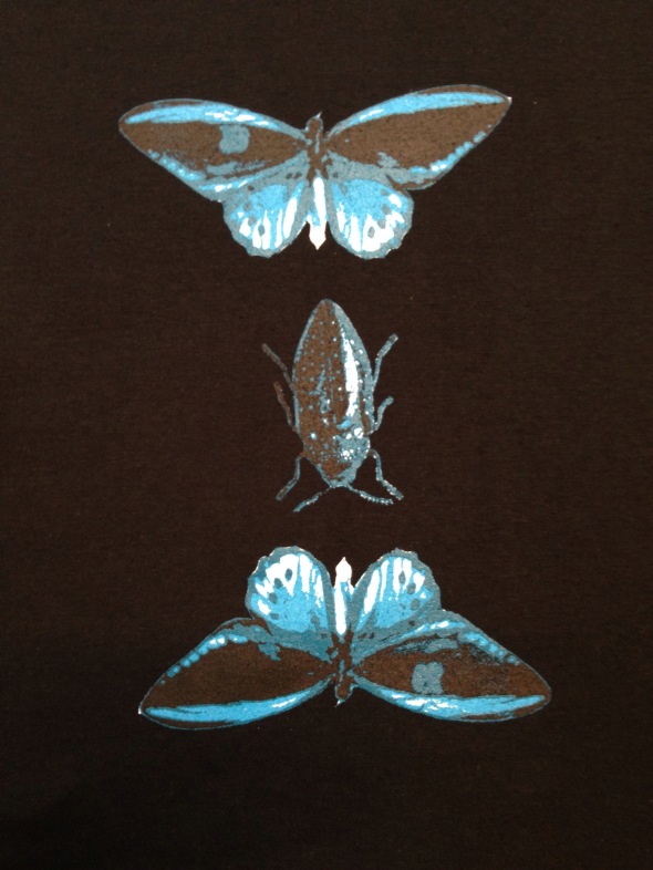
Posted: February 14, 2015 Filed under: ADZ5888, field2, print | Tags: Art, field, print, textiles, workexperence Leave a commentToday was my final day of placement and the day I could print my design onto some garments. As I didn’t have a base screen for my design it did cause some issues such as me having to pull the screen twice which made the print slightly thicker and added a shine but as a result of this it did spark an idea for one of the garments. I was printing black on black and reflecting on the idea of pulling the ink through twice it added shine to the garment which created a very interesting result.p, this meant that now the black ink was visible and an interesting effect.
As I had to work on the design on my own I had to make all the adjustments to the machine to line up the screen with the film work, I found this particularly difficult because you have to think in a different way and I kept focussing on the wrong section. After communicating to the technician printer about this he helped to guide me and figure out a way to understand this in a simpler way.
Another issue that occurred was that because I didn’t wash out the screen throughly enough the emulation left in the screen resulted in me losing some of the detailing in the art work also the screen was not shot long enough so again some of the detailing was lost as a result of this. To overcome this issue we printed the layers in different sequences to establish what would produce the best outcome as a result by layering selected layers more than some enhanced the shading and highlighting which helped to create the elussion of a more detailed print.
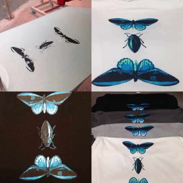
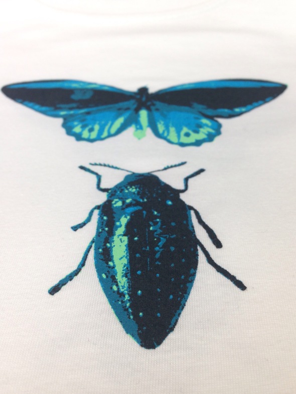
I experimented with different colour garments to establish is some effects would work better than others, I tried the same effect as black on black on the White T-shirt by printing white on white, this effect wasn’t as interesting so I decided to change the White to a pastel green which really complimented the Cyan blue and dark blue. I also printed on two other shirts one a charcoal shade and one grey I believe the grey was a particularly good outcome as the grey garment really makes all the colours pop. Out of all of these the White T-shirt with the change of colour was the most successful print as the smaller details of the print such as the bugs antennas as defined by the bright green outline. This result was so successful the print technician begged to have one printed for him that he could keep. I was really flattered by this and it has given me self confidence with my decision making and design work.
Overall I have really enjoyed today and how successful the quality of my prints were. I believe by continuing to use these skills that I have learnt today will enable me to mp be a more professional printer in the future which will allow me to produce high quality products. I plan to buy a laser to help me to line my work up in university to ensure that I have a more accurate line up when layering my screens in future I believe this will be init me a considerable amount.
9.02.15 Work experience Visible ART
Posted: February 9, 2015 Filed under: ADZ5888, Constellation, print, textiles | Tags: ADZ5888, constellation, print, textiles Leave a commentThis week I will be going through the whole process of creating my design, producing the visual, shooting the design, printing and treating the end result.
I started my design today but struggled to keep up with the deadline as my laptop kept crashing, to overcome this issue i saved my work onto a USB and opened my images on Photoshop and asked for some help from the product manager to select the layers and how to fill in the pixels.
As my design was highly detailed I had to adjust the tolerance so that the software is able to pick up the colours I wanted to isolate. By using the software RIP it creates half tones that create a smoother finish and fills in any missing pixels.
After deciding on the measurement of the art work REG marks are added and labels are put above the work so the printers know what layers are what also this will prevent the art work being exposed upside down or back to front. I then had to edit the canvas size and move the layers to be printed onto the film (60 x 40 cm). I was told that it is very important never to set the art work side ways as the weight of the film in the printer can stretch the design and this can leave the art work layers uneven and out of line. I then had to colour in the layers of the art work in black for the art work to be printed.
As my work is high detail it will need to be put onto a higher mesh screen, I will be using plastisol inks for this job.
Overall today has been a very productive and successful day, I am really happy with the design and I am very excited about shooting my own screen tomorrow and completing all the stages of the screen printing process, I have arranged the garments that the design will be printed onto later in the week I will also be creating a repeat pattern of my design to have printed onto poster paper.I look forward to the final outcome and what I will learn during the last few days here. I have thoroughly enjoyed my experience so far and look forward to presenting my work in my presentation next week.
Field 11/12/2014 Experimentation
Posted: December 11, 2014 Filed under: ADZ888, Field, print, sewing, textiles | Tags: ADZ4888, field, print, sewng, textles Leave a commentToday i was supposed to hand in my USB stick to upload my presentation but was unable to find my teacher so I took advantage of the chance to finish producing some more samples.
I originally wanted to create a series of embroidery colored threads using bullion knots to create texture and dimension but after several successful knots the rest began to snag and fall through the material i was using. This was a big disappointment for me because i wanted to relate it to the colored dots that we looked at during one of the lectures in field. So today i used the digital sewing machines to produce a series of these circles instead. I am glad I ended up using this method because the final outcome looks very professional and tidy. I took me over two hours to do a small sample because i had to keep re-threading the machine, this was done thirty times in total.
.


Later Steve the print technician exposed a screen for me with my beetle design and I experimented with the colours and textures. By using complimentary colours I feel as though the images have more of a positive effect on the viewer, this is something that I want to achieve during subject so believe this experiment had gone well. I prefer the original image of the beetle outline opposed to the inverted style one as the effect i was aiming to create had been more successful for the original design. Although the second design could be interesting if i experimented with it some more which I might do in the future.
I thought i would experiment with bold colors that are complimentary, so rather then using spatters of paint to create a more abstract look i have opted for single vibrant colours. I really like how image one has come out and how i subconsciously put the primary colours either side to create a secondary colour in the middle.
I also believe image two is quite an interesting design by using the yellow as the block background colour it is very eye catching and i believe this creates a colour experience for the viewer through the contrast of a colour which is typically associated with happiness with the cool blues and greens of the beetle.

 For my project I wanted to create a metalic effect for the beetles shell so I had a go at experimenting with foil, the sample its self didnt come out as strongly as I had hoped but I will try again in the future to see if I can achieve my desired look. I do love the reverse of the foil that was peeled off the sample and i will be using this to sew on to some fabric and see what else i can do with it.
Overall I am really pleased with how successful today had been and now feel more confident about my presentation Tuesday as I can now add these images which are better than my previous samples. I feel as though I have moved forward with my designs and understanding of colour and I am really looking forward to developing these into a final design in the coming months.
I will be in the workshops next week to use the digital sewing machines to see how i can create my beetle design through stitch. I feel as though I have more control over colour in the print studio as I can mix the colours to how I want but after today working in the stitch room i now realize there is a bigger collection of colored threads than i had originally thought so I look forward to using these next Thursday.
Individual work: Using fabric dyes.
Posted: April 10, 2014 Filed under: Field, Subject | Tags: ADZ4777, ADZ4888, Art, print, textiles Leave a comment
Today i made a mini dye bath with Dylon fabric dye, I soaked the leave’s in there for about 45 minutes whilst following the instructions on the back of the packet. Unfortunately the dye was much darker than i expected it to be even though i only used a small amount of it. Also the detailing had been lost and the paint from the prints started to turn gloopy. In future i will remember to dye the fabric before i print onto it.
To get an idea of what shade i wanted i cut of scraps of Calico and liquidated the dye and used different measurements of salt, hot water and the dye to achieve different shades. This will give me an indication in the future how much or little i need before i commit my final piece to the dye.
Individual work: Composition of leave’s
Posted: April 10, 2014 Filed under: Field, Subject | Tags: ADZ4777, Art and design, print, textiles Leave a comment
After creating the texture i was looking for i am now considering the composition of the leafs and how i am going to sew them onto my martial. When organizing them i considered ways of perhaps incorporating a repeated pattern or other compositions. In the end i decided to over lay the leaves in a way that they would all overlap and create a repeated pattern in the direction that they are placed opposed to an actual design pattern.
Whilst looking at them i thought why not just sew them together and create a blanket in that sense rather than sew them onto a piece of material? I will be experimenting with Dylon dyes to see if the dye will take to the Calico, I feel as though it would bring a more realistic effect if the leave’s had a brown tint to them opposed to cream.
Individual study days.
Posted: April 10, 2014 Filed under: Field, Subject | Tags: ADZ4777, ADZ4888, Art, Art and design, print, textiles Leave a commentOver the past week i have been trying to find ways to create the crispy texture that i am looking for that you would typically find with a Autumn leaf. After asking around for some advice my mum suggested starch, i used this by spraying it onto the fabric and using my hair dryer to dry them whilst squeezing them in my hand. Unfortunately this didn’t give me the effect i was looking for and caused the material to fray. After trying a few more times i decided to leave them until the morning and try again and left some that i had sprayed out on the floor. When i woke in the morning they were just how i had visioned them to be and what i was trying to achieve, The martial had creased up and curled giving a very textured look. I couldn’t be happier with this result and i am looking forward to developing into these further.
Individual work working progress screen printing
Posted: April 5, 2014 Filed under: Field, Subject | Tags: ADZ4777, ADZ4888, Art, nature, print, textiles Leave a comment
After visiting my old foundation course building to pick up some work i got talking to the course administrator and explained my situation. She then suggested to ask to print technician if i could use his facilities to do some sampling. After asking he was happy to help and asked that i leave a small donation at reception for what ever materials i used. During my time there i got a lot of work done within a small amount of time which was very pleased about this included photographing my leave’s, editing them on Photoshop, experimenting with different affects, printing them out, transferring them onto a silk screen and then producing a series of samples.
The effects which interested me the most were the ones that had defined features and texture to them. I experimented with granite, sketch and the dotted effect. Even though the dotted effect gave the most realistic affect i wanted to go for something more textured and decided to opt for the sketch and granite effect and see what they would look like once transferred, i discarded two of the granite effect leave’s because they were too dark and didn’t pick up on much detail.
Printing down the length of a piece of fabric i experimented with various harmonious tones such as browns, greens and sometimes yellow. I splashed the paint onto the screen to get my desired effect of multinational shades within the leaf.This technique worked just as a i hoped it would. I will now be cutting out the leave’s and experimenting with how i can create a textured effect that would be found on a dried out leaf e.g. an autumn leaf
.![IMG_0906[1]](https://amytheresaduffield.wordpress.com/wp-content/uploads/2014/04/img_09061.jpg?w=300&h=224)
Print Work shops 01/09/2013 to 22/10/2013
Posted: December 3, 2013 Filed under: Subject | Tags: ADZ4777, Art and design, Dye, Heat transfer, print, Print room, Screen printing, Transfer-print Leave a commentOver the past four weeks these print shops have been very interesting. I have learnt new techniques that i didn’t know existed before i started this course for example discharging ( example 2). We have used dye baths, heat transferring, exposure machine, silk screens and many more techniques that i hope i will be using in the future. Overall these workshops have been very good fun and very interesting ill be looking forward to using the print room again next term.
Heat transfer printing with the use of skeleton leafs on synthetic fabric.
Dye bath sample with left over thread sewn on top




![IMG_0925[1]](https://amytheresaduffield.wordpress.com/wp-content/uploads/2014/04/img_09251.jpg?w=300&h=224)
![IMG_0927[1]](https://amytheresaduffield.wordpress.com/wp-content/uploads/2014/04/img_09271.jpg?w=224&h=300)
![IMG_0935[1]](https://amytheresaduffield.wordpress.com/wp-content/uploads/2014/04/img_09351.jpg?w=224&h=300)
![IMG_0937[1]](https://amytheresaduffield.wordpress.com/wp-content/uploads/2014/04/img_09371.jpg?w=241&h=323)
![IMG_0913[1]](https://amytheresaduffield.wordpress.com/wp-content/uploads/2014/04/img_09131.jpg?w=300&h=224)
![IMG_0910[1]](https://amytheresaduffield.wordpress.com/wp-content/uploads/2014/04/img_09101.jpg?w=224&h=300)
![IMG_0909[1]](https://amytheresaduffield.wordpress.com/wp-content/uploads/2014/04/img_09091.jpg?w=224&h=300)
![IMG_0914[1]](https://amytheresaduffield.wordpress.com/wp-content/uploads/2014/04/img_09141-e1397140805270.jpg?w=224&h=300)
![IMG_0907[1]](https://amytheresaduffield.wordpress.com/wp-content/uploads/2014/04/img_09071.jpg?w=224&h=300)
![IMG_0908[1]](https://amytheresaduffield.wordpress.com/wp-content/uploads/2014/04/img_09081.jpg?w=224&h=300)
![IMG_0903[1]](https://amytheresaduffield.wordpress.com/wp-content/uploads/2014/04/img_09031.jpg?w=300&h=224)


